Create Light and Dark Themes for Nostr WoT
Build a custom palette, add a paired light and dark theme, and contribute your changes to the Nostr WoT extension.

Choose the right route
For your own installation, open Settings → Appearance and language → Create custom theme. Paste the JSON below, choose Parse JSON, then Apply custom theme. Custom JSON stores one palette. It does not switch automatically between light and dark. To offer both modes, contribute a built-in theme as described below.
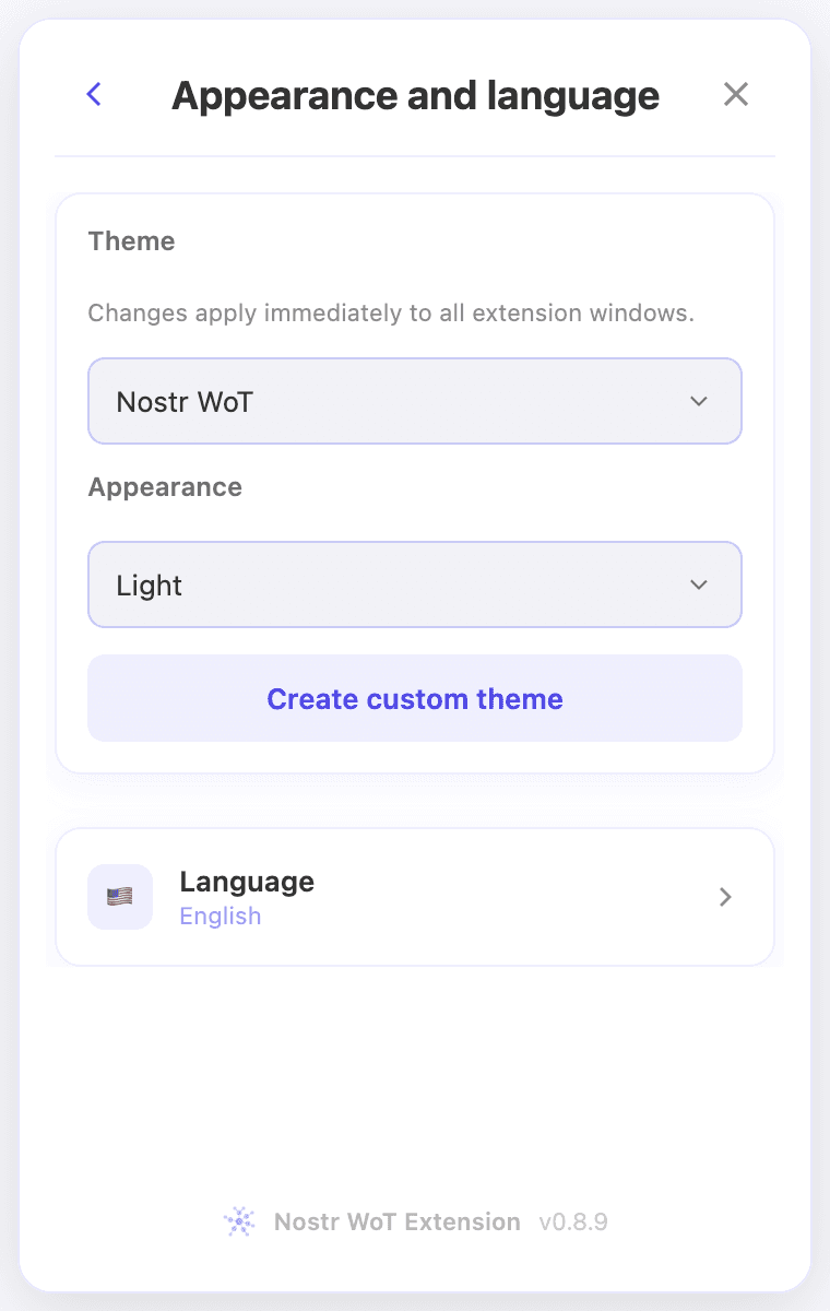 Appearance settings in a demo installation, shown in English.
A complete custom palette
This is the editor’s dark starter palette. Keep all 20 keys. Use six-digit hexadecimal colors for a straightforward starting point. Unknown keys, missing colors and arbitrary CSS are rejected. The editor also accepts eight-digit hex and the supported rgb/rgba syntax. A theme changes appearance, not permissions.
{
  "bgPage": "#0b0d12",
  "bgPageSolid": "#0b0d12",
  "bgHtml": "#07090d",
  "bgElevated": "#151922",
  "surfaceHover": "#252c38",
  "inputBg": "#1c222c",
  "textHeading": "#ffffff",
  "textBody": "#e8eaf0",
  "textSecondary": "#c4c8d2",
  "textMuted": "#9da4b2",
  "brand": "#818cf8",
  "brandHover": "#a5b4fc",
  "textOnBrand": "#080b12",
  "cardBg": "#151922",
  "cardBorder": "#343c4a",
  "controlBorder": "#687386",
  "success": "#6ee7b7",
  "error": "#ff909b",
  "warning": "#fcd17a",
  "info": "#93c5fd"
}
Add a built-in theme with two modes
Fork the extension repository and create a focused branch. Use Node 24.15+ in the 24.x line, then install and build:
npm ci
npm run build
Use the existing theme system
- Add your theme ID to
THEME_OPTIONSinsrc/constants/appearance.tsand toProjectThemeinsrc/domain/appearance/theme.ts. The resolver uses your ID for dark mode andyour-theme-lightfor light mode. Keep the existing Light, Dark and System behavior. - Add the display name to
PROJECT_LABELSinsrc/screens/Settings/AppearanceSection.tsx. Presets are generated fromTHEME_OPTIONS; reuse the existing selector and storage service. - Define both selectors in
src/styles/theme.css, following an existing paired theme such as Coracle. Set the semantic colors for backgrounds, text, controls, focus, borders and status states. Check inherited tokens too. Do not simply invert a dark palette or add per-component color exceptions.
Theme and mode are stored separately as appearanceTheme and appearanceMode. System mode follows the operating system, including changes while the extension is open. Custom JSON and La Crypta are fixed palettes. Do not replace this behavior with another persistence mechanism.
Check the result
Load dist/ as an unpacked extension in Chrome. Check the popup, onboarding, settings, approval requests and dialogs in Light, Dark and System. Check keyboard focus, hover, selected, disabled and error states, QR codes, long text and narrow windows. Aim for at least 4.5:1 contrast for normal text and 3:1 for large text and meaningful controls. Test actual foreground/background pairs, including translucent surfaces.
Extend the existing tests for your theme, then run the checks:
node --import tsx --test tests/custom-theme.test.ts tests/theme-tokens.test.ts tests/theme-handoff.test.ts
npm run typecheck
npm run lint
npm run build
./tests/run.sh
Open a contribution
Open a pull request with a short description, your palette sources or licensing, screenshots of both modes using demo accounts, and the commands you ran. Include collapsed and expanded controls. Keep generated builds, archives, real account details and private keys out of the commit. Follow the repository’s contribution and component standards.
Optional install links
If your theme needs an installation link, update the website’s theme allowlist as well as the extension and cover the handoff tests. A custom JSON palette cannot be supplied in the URL. Existing choices must never be overwritten. Read the handoff documentation before changing this flow.
Related video walkthroughs
These videos are in English.